Case Study · Self-directed

Improving transaction search in the SEB app
A personal project. I looked at how you search and filter transactions in SEB’s banking app, worked out what makes it hard, and drew a set of screens that fix it using SEB’s existing style: filters that stay on screen, a way to pick a date range, an easier-to-read transaction row, and a search box you can ask a normal question — it then shows you the filters it used so you can change them. These are mockups, not real SEB work.
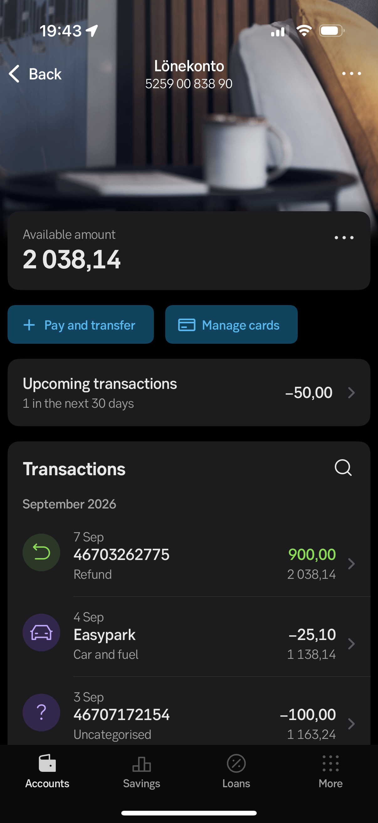
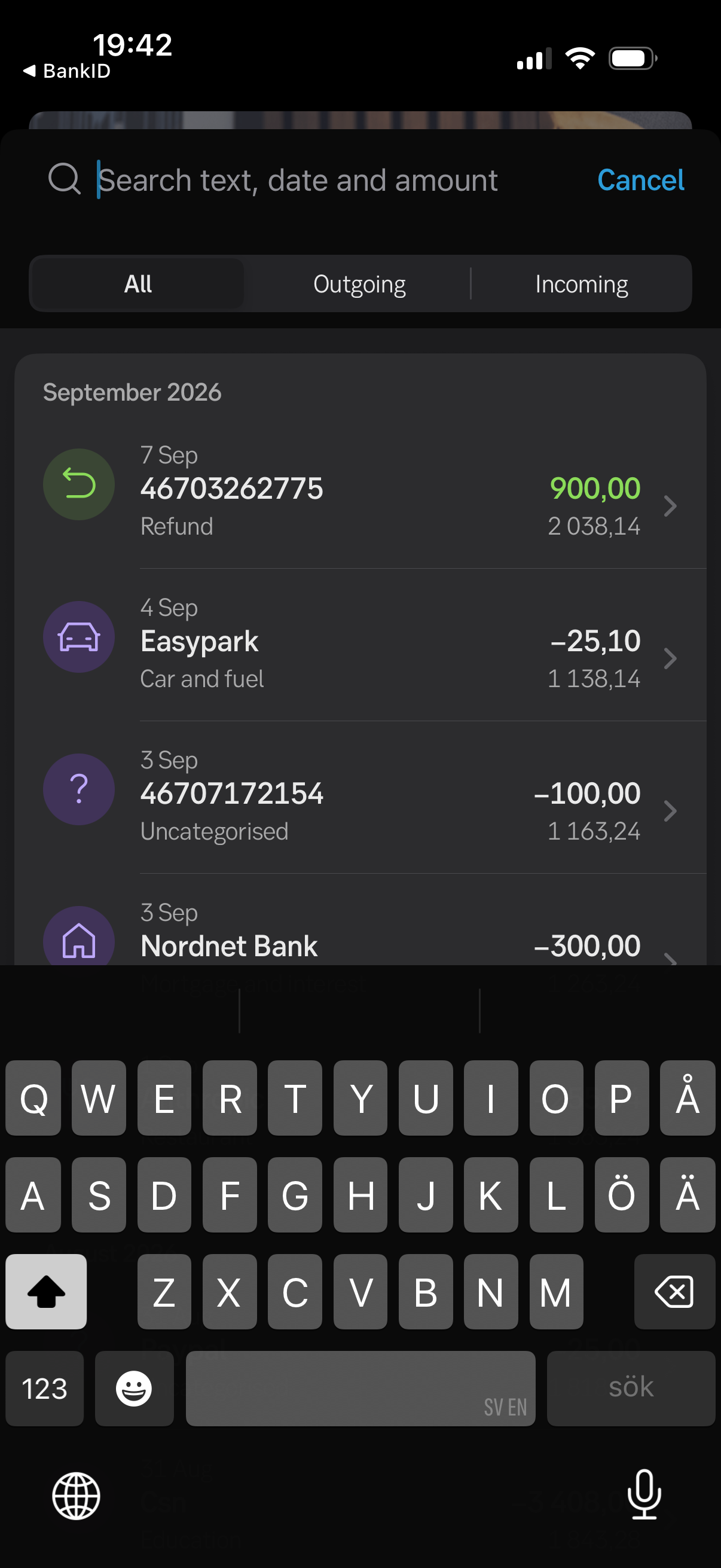
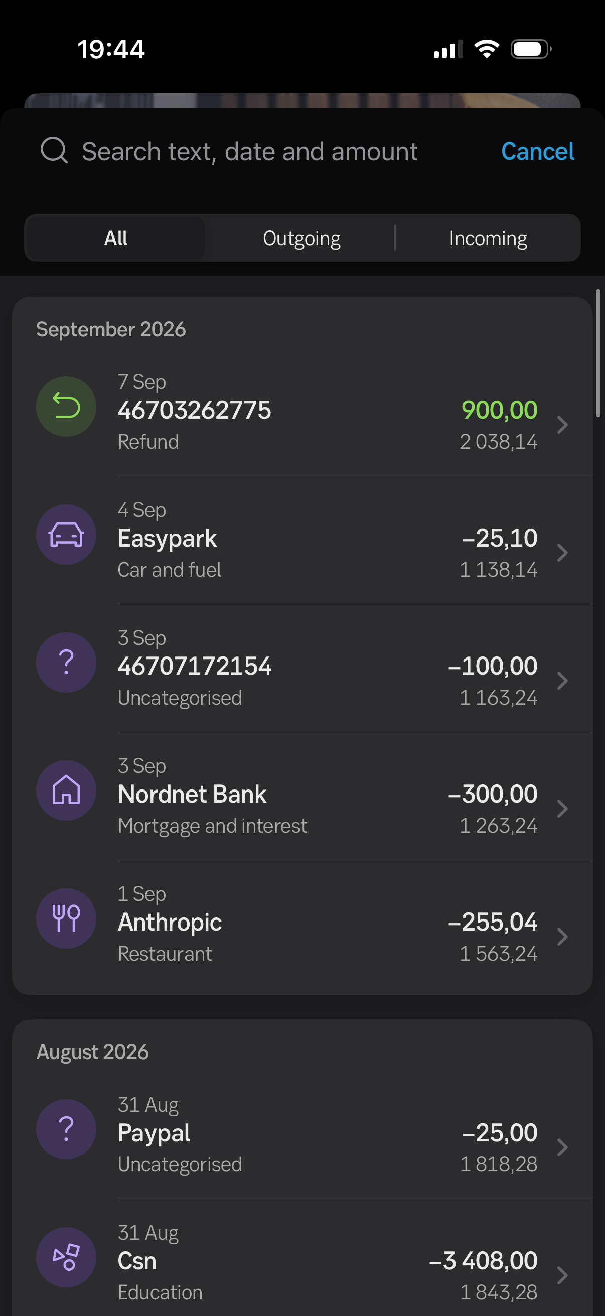
How SEB transaction search works today (iPhone app, September 2026). These are what I based the analysis on.
At a glance
What this is
A personal project. Not work for SEB or a client.
What it covers
How you search and filter transactions in the SEB iPhone app, and how readable the list is.
What I worked from
Six screenshots of the live apps — three from SEB, three from Klarna. I had no access to SEB’s team, data or research.
What I made
This write-up, plus six mockups drawn in SEB’s existing style.
The main problem
People usually remember a payment by what it was for, where they were, who they paid, or roughly when. SEB’s search only works if you already know the exact shop name or amount. If you don’t, you just scroll.
Summary
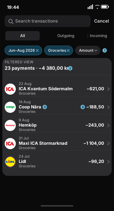
The problem. SEB’s search only helps if you can type the exact shop name or amount. There is no filter by category, no way to pick a date range, and you can’t just ask a normal question.
What I found. The list you scroll through is also unreliable. Swish payments show up as phone numbers. Some payments are misclassified — a software subscription filed as a restaurant, a stockbroker filed as a mortgage — and a misclassified payment also picks a misleading icon.
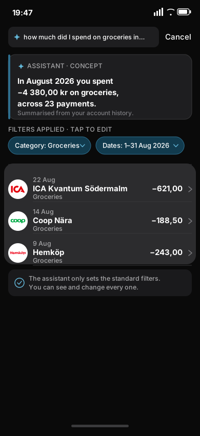
What I’m proposing. Keep the SEB app as it is and add four things: filters that stay on screen, a way to pick a date range, an easier-to-read transaction row, and a search box you can ask a normal question. The question turns into the same filters, shown on screen, plus a short answer — and you can change any of it.
How I did this
What I did
- Went through the search screens one by one and wrote down every control and piece of information.
- Listed the questions people actually have about their spending, then checked which ones the app can answer.
- Checked the sample transactions for inaccurate names and misclassified categories.
- Built the new screens using SEB’s existing colours, fonts, spacing and components.
What I couldn’t do
- I had no access to SEB’s users, data or plans — this is based on six screenshots.
- The mockups show interface ideas only. I’m not claiming anything about how SEB’s systems work or how it decides categories.
- I didn’t redesign the app in a new style. Everything stays in SEB’s current look.
How SEB search works today
1. Getting to search
Search is one small magnifier icon above the transaction list. Tapping it opens an empty box with the keyboard up — no recent searches, no filters, no suggestions. You have to know what to type before anything helps.
The account screen does have one nice touch: a plain line saying “Upcoming transactions — 1 in the next 30 days”. Nothing that simple shows up once you start searching.
Where it falls short
A. Almost no filters
The only filter is In or Out. There’s no way to pick a date range — not even “last 3 months” — so finding an old payment means scrolling month by month.
B. It doesn’t match how people remember payments
People think “groceries”, “that restaurant”, “money I sent Anna”, or “early last month”. Search only helps if you already know the exact words the bank used or the exact amount.
C. The name shown isn’t consistent
Swish payments show up as phone numbers, in the biggest spot on the row. Card payments show a proper shop name. So half the list is easy to read and half isn’t.
D. Misclassified categories, and the icon repeats the mistake
Anthropic (a software subscription) is filed as “Restaurant”. Nordnet Bank (a stockbroker) is filed as “Mortgage and interest”. The icon is picked from the category, so a misclassified category shows a misleading icon too — and there’s no obvious way to fix it.
E. The icons don’t help much
Nearly every row has the same purple circle. It sits in the spot that draws the eye first but tells you very little — and it actively misleads you when the category is misclassified.
F. The useful things are the smallest
A reference number you don’t care about is the biggest text; the category you do care about is the smallest. There’s no time of day, no payment method, and no daily totals.
A quick look at Klarna
Klarna’s purchases screen only covers card and invoice payments, but its filtering is well done: Date, Store and Source filters that stay on screen, a date filter with quick presets and a custom range, real shop logos, and totals for each day. I’m using it as a reference for the direction to go, not something to copy. It also has an assistant button, but I can’t tell what it does from a screenshot, so I’m not assuming anything about it.
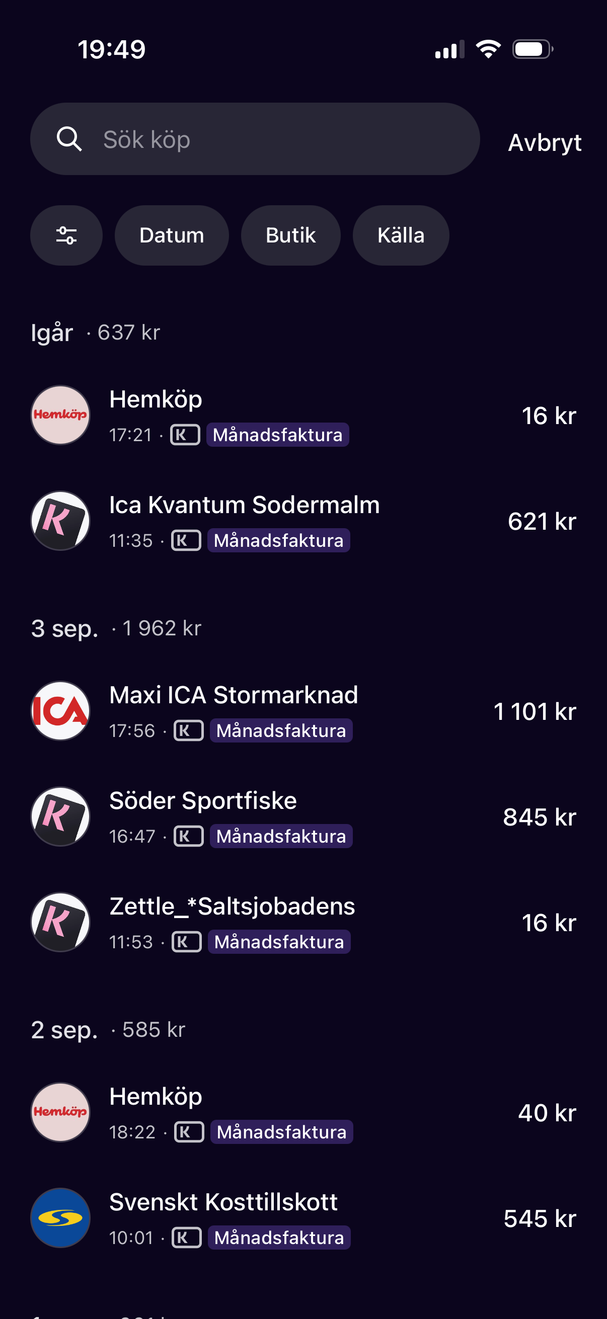
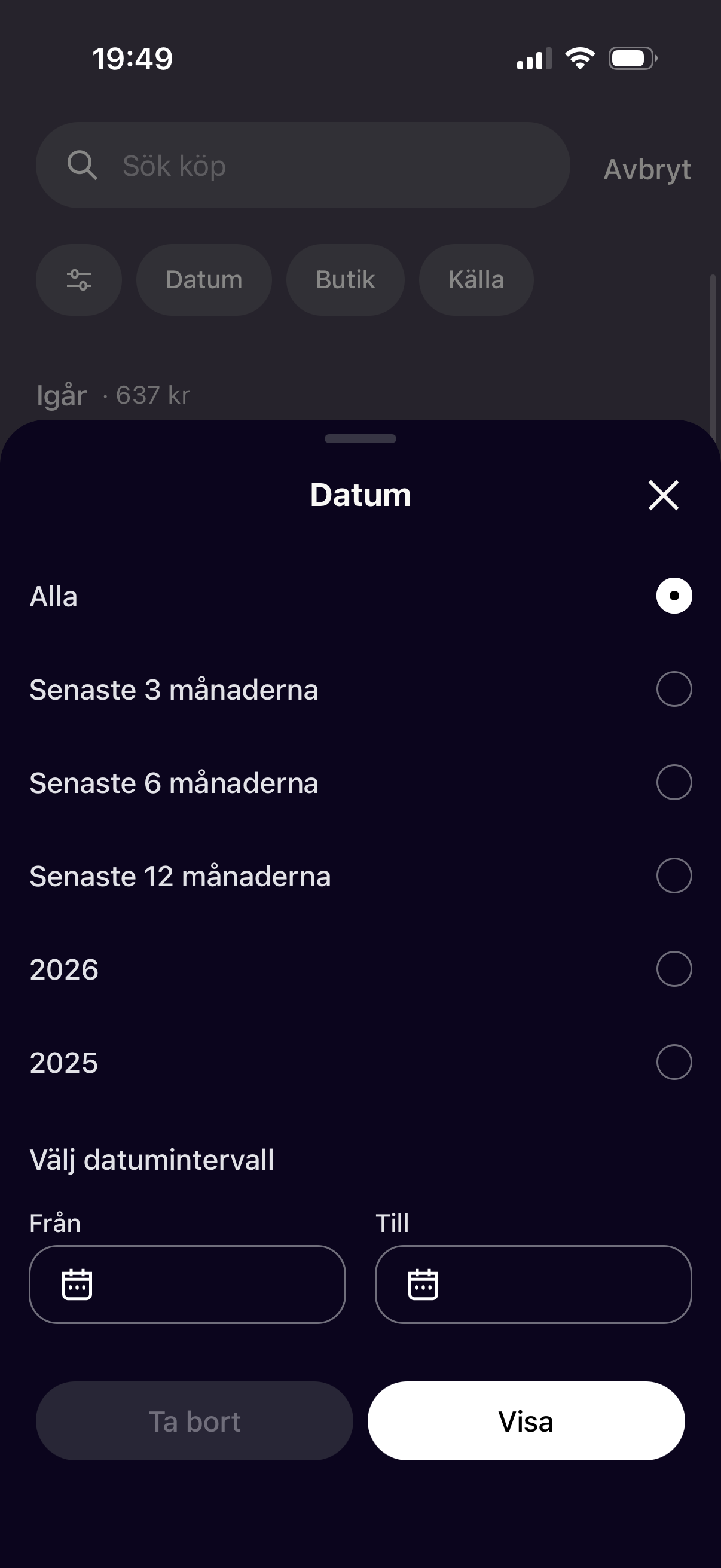
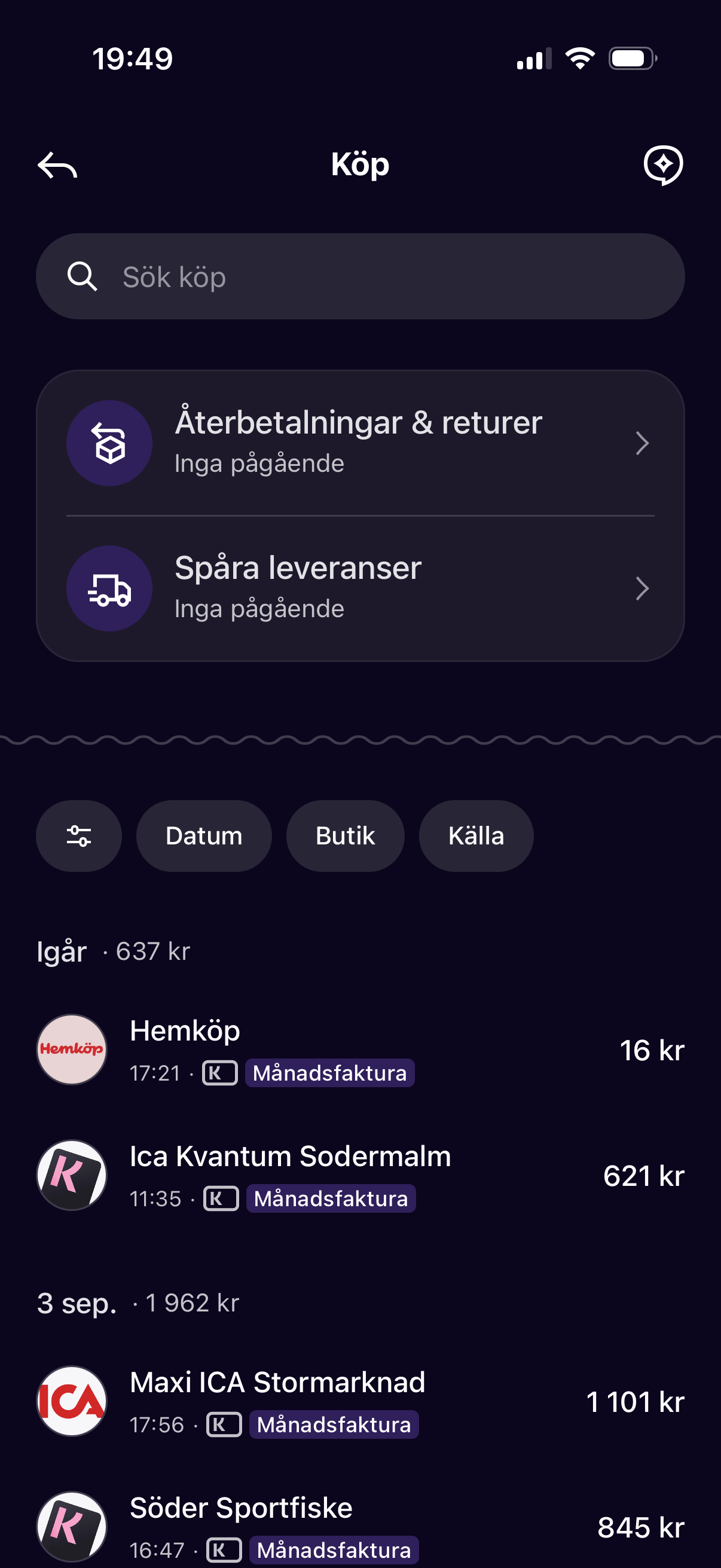
Left to right: filters that stay on screen; a date filter with presets and a custom range; the list grouped by day with totals and real shop logos.
Rules I set for myself
1. Use SEB’s existing look
Same fonts, colours, spacing and components. You shouldn’t be able to tell my screen from a real SEB screen at a glance.
2. Add to it, don’t rebuild it
Every change is a control added to a screen that’s already there. The app’s structure and the way you get to search stay the same.
3. One set of filters
Date, category, shop, amount, account. Everything uses the same filters, including the search box you can ask a question.
4. The AI is a shortcut, not a mystery
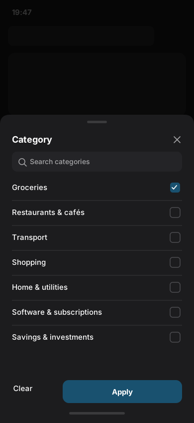
Your question turns into the normal filters, shown on screen, plus a short answer. You can change any of them. If the question isn’t clear, it just opens the normal filters.
The proposed flow, step by step
About these mockups
These screens are my own mockups. They are not real SEB work and are not connected to or approved by SEB. I drew them in SEB’s current style to show how the changes could fit the existing app. They don’t say anything about how SEB’s systems work or what SEB plans to do. The transactions shown are made up.
Open search and see the filters → pick a date range → read a shorter, clearer list → ask a question in plain words → change any filter the AI chose.
Step 1 — Search, with filters on screen
- What’s new
- A row of filter buttons — Date, Category, Amount, Account — under the existing tabs, using SEB’s pill shape. Below that, a quiet “Ask about your transactions” row opens the question search.
- Why
- You can see straight away that you can filter. The question search is there if you want it, but it doesn’t get in the way.
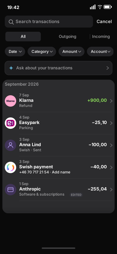
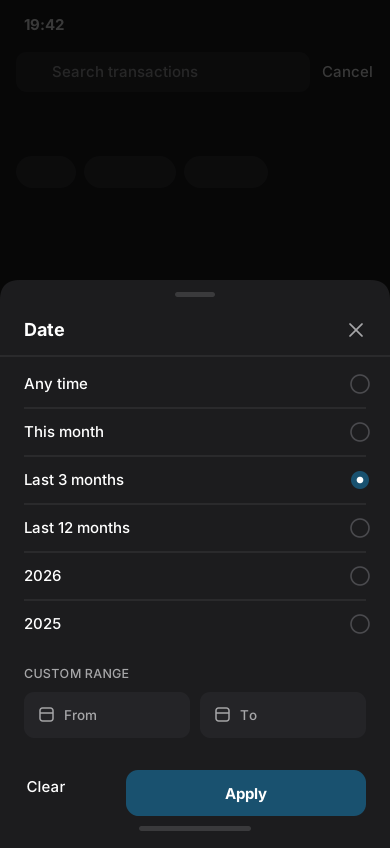
The transaction row: before and after
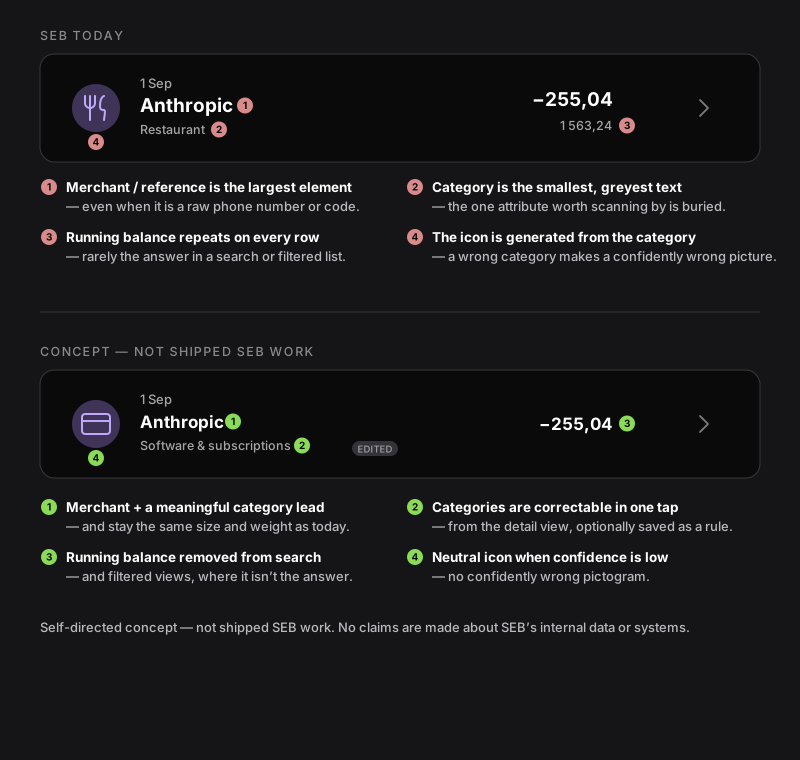
- Same size. The row height, the icon, the date and the amount on the right all stay where they are.
- Reordered. A proper shop name and a useful category become the clearest things on the row. The account balance is no longer shown in search results.
- Fixable. You can change a category in one tap from the payment’s detail screen. When the category isn’t certain, the row shows a plain grey icon instead of a confident but inaccurate one.
Skills & tools
Design
UX/UI design
Mockups drawn in SEB's existing visual language, from concept sketches to hi-fi screens.


Research
Competitive & heuristic analysis
Screenshot-based audit of the current flow, benchmarked against Klarna.
How I’d test this
Research
- Ask people to write down the questions they have when they look at their transactions.
- Ask people to find specific payments in the current app, and time how long it takes.
- With permission, check a set of real transactions to see how often the category is misclassified.
Testing the mockups
- Show the screens without SEB’s name and ask people whose app they think it is.
- Compare asking a question vs. tapping filters — which is faster, and which do people trust more?
- Does showing the filters behind an AI answer make people trust the answer more?
Numbers to watch
- How often people find what they’re looking for, and how long it takes.
- How often a search ends with someone scrolling and giving up.
- How often people fix a category, and how often the same mistake comes back.
- How many people contact support asking what a transaction is.
- How many people use the question search, and how often they change the filters it picks.
I did this because I want to work on fintech products. It shows I can take a real app, work out what’s actually holding it back, and suggest a fix that fits the product — keeping in mind that banks have to deal with trust, regulation and information they don’t always have.