Case Study
A self-initiated concept where I designed and built an end-to-end design-system product flow, from first setup to editable token and component surfaces.
Outcome Snapshot
Role
Independent Product Designer + Frontend Builder (React/TypeScript)
Timeline
January-February 2026
Team
Solo concept project (no customers or clients involved)
Problem
Most design-system tools either overwhelm first-time users or hide too much control. I wanted to design a concept that supports both fast starts and deep editing across the same product.
Measurable outcomes
- 14 routed product surfaces implemented in the prototype shell (source: src/App.tsx route map, audited February 2026).
- 10 core feature screens designed and built in one coherent flow (home light/dark, create-from-scratch state, AI generation, import from code, design tokens, colors, typography, buttons, component builder).
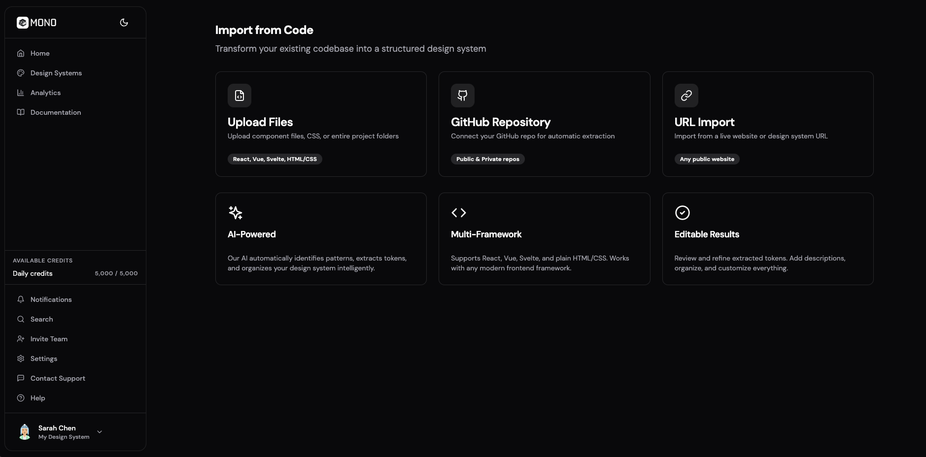
- 3 import methods designed in one flow (file upload, GitHub repository, URL import) with a 5-step progress state model.
1. 30-second summary
Mono is a self-initiated concept I built to test a complete design-system product journey, not just isolated UI screens. I designed the UX and implemented the frontend so every feature could be evaluated in a working flow.
The concept covers multiple entry paths and production-like editing surfaces: create from scratch, generate with AI, import from code, and structured editing across tokens and components.
2. Problem + constraints
I wanted Mono to answer one practical question: can a single product let users move from zero to a usable design-system foundation quickly, while still offering detailed control over colors, typography, buttons, and components?
- Solo scope required tight prioritization around high-signal flows instead of full feature completeness.
- No customers, clients, or delivery stakeholders were involved, so I set the product direction and success criteria myself.
- No production backend in this phase, so persistence and user/workspace context were handled through local storage.
- No live user analytics yet, so outcomes are framed as shipped scope plus realistic product-readiness proxies.
3. My role + ownership boundaries
I owned
- Product framing, information architecture, and UX/UI for dashboard, creator, import, and settings flows.
- Frontend implementation in React + TypeScript + Tailwind + Zustand persistence.
- Interaction details for multi-path creation, processing states, and token editing surfaces.
I shared
- No shared ownership in this phase; product direction and execution were independently driven by me.
- External references were used only as market benchmarking, not as stakeholder requirements.
- All roadmap and quality decisions were self-managed in a solo concept cycle.
Out of scope
- Real backend ingestion pipeline and asynchronous job orchestration.
- Live team collaboration, permissions, and enterprise security controls.
- Production validation with instrumented activation and retention funnels.
4. Key decisions
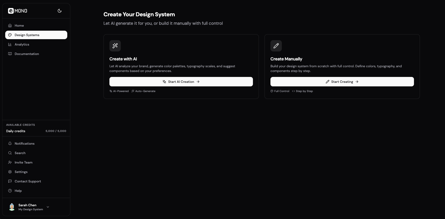
1. Design parallel entry paths for different starting points
- Decision
- I built two explicit creation paths: a manual create-from-scratch state and an AI-assisted generation flow, both converging into the same editable system.
- Why
- Different users start differently. Some need immediate structure, others want full control from the first click.
- Result
- Mono supports both starting behaviors without forking into separate products or inconsistent data models.
2. Make code import transparent and staged
- Decision
- I designed Import from Code with three source options and explicit progress steps (uploading, analyzing, extracting, generating, complete).
- Why
- A single spinner hides what is happening and reduces trust in AI-assisted setup.
- Result
- The flow communicates system behavior clearly and creates a ready pattern for future real backend processing.
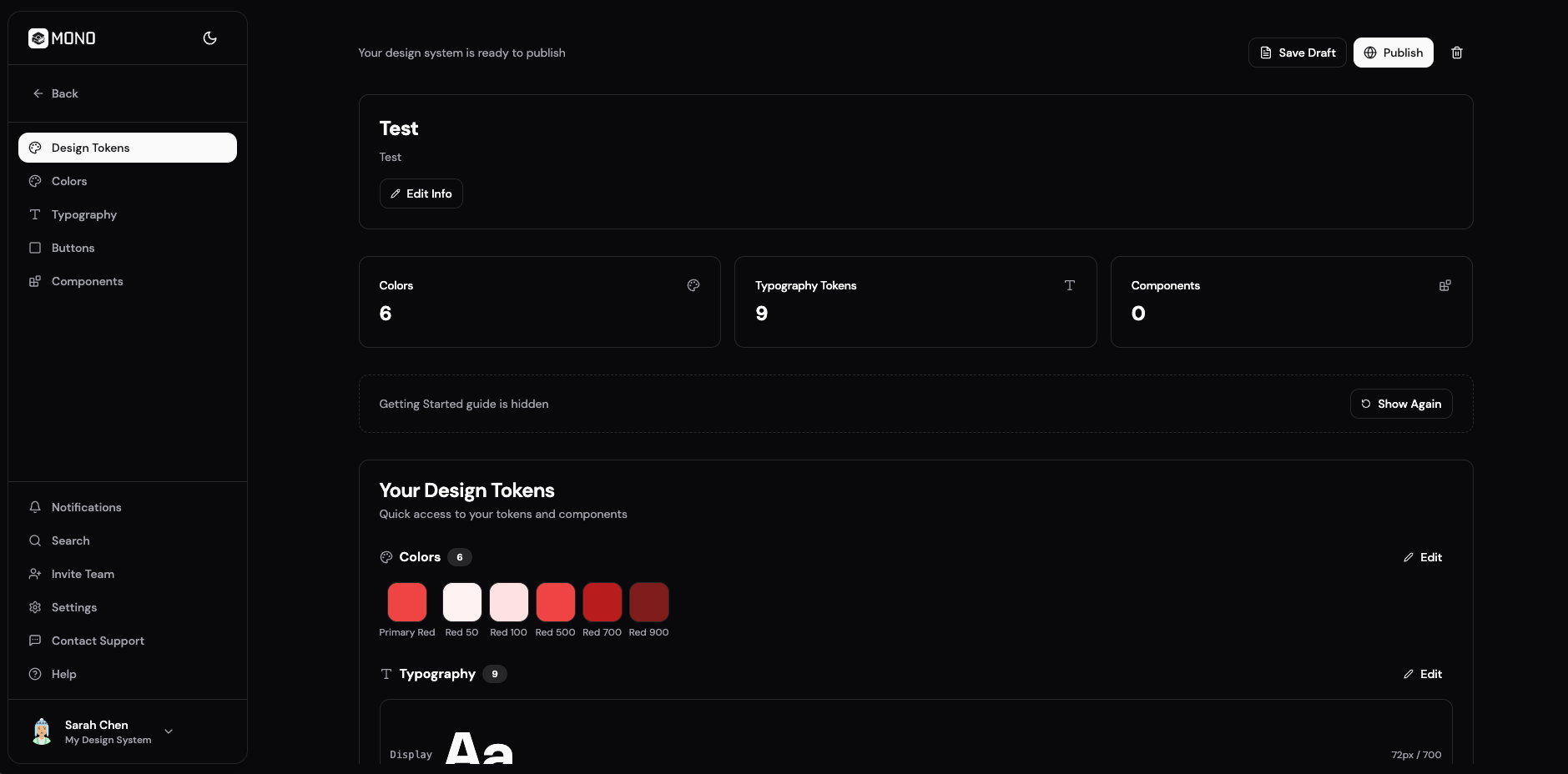
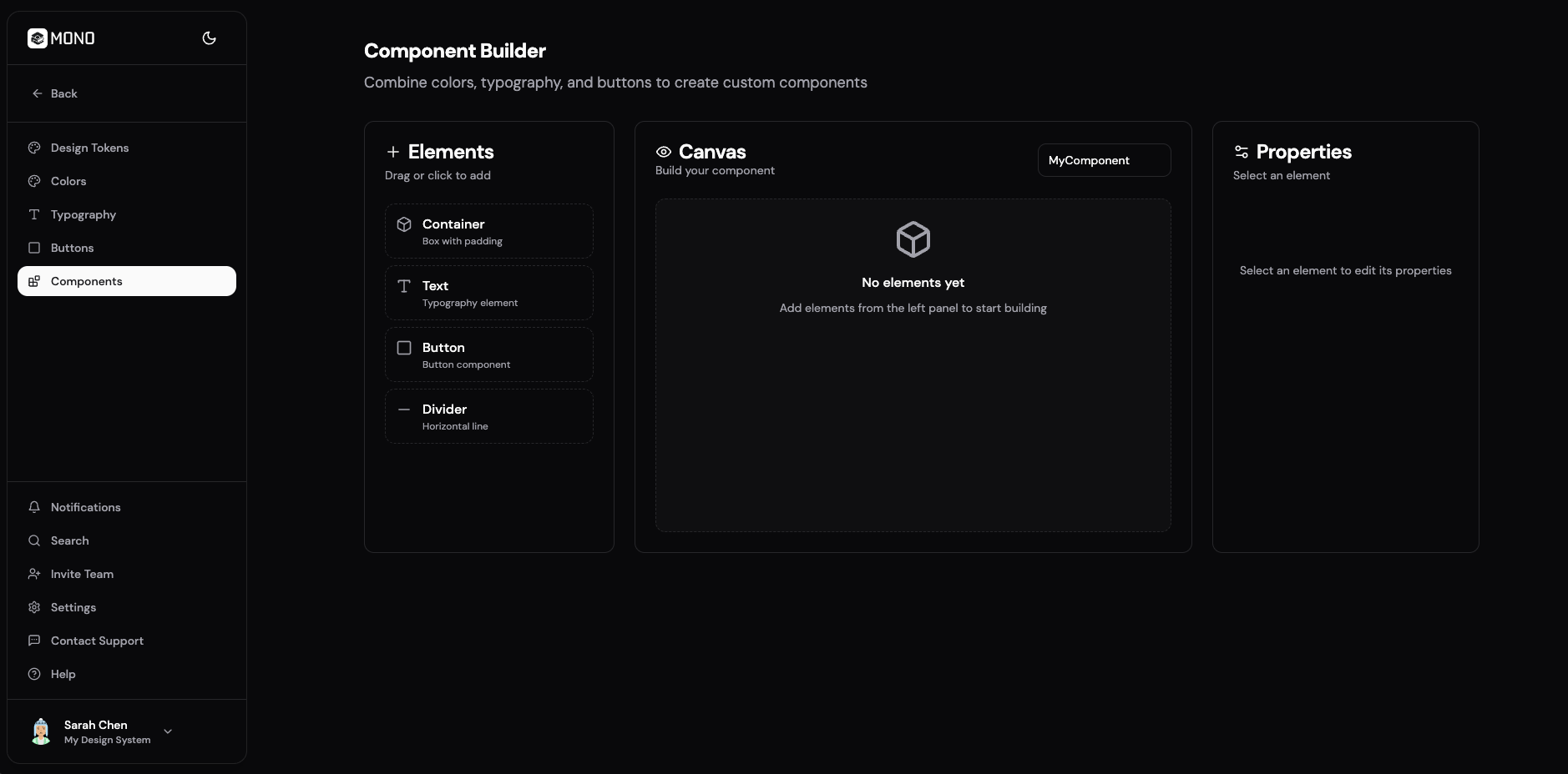
3. Treat editing surfaces as first-class product modules
- Decision
- I built dedicated screens for design tokens, color scheme, typography, buttons, and component builder instead of hiding these in one overloaded panel.
- Why
- Focused surfaces reduce cognitive load and make progression through setup/editing clearer.
- Result
- The concept demonstrates a modular editing system that feels navigable and scalable as feature depth grows.
5. Outcomes
This is a solo concept outcome set, so evidence focuses on shipped scope and feature completeness rather than customer performance.
Measured
14 routes
Implemented in the application shell
Counted from defined routes in src/App.tsx during February 2026 code audit.
Measured
10 feature screens
Delivered across onboarding and editing workflows
Covers home (light/dark), manual setup, AI generation, import from code, design tokens, colors, typography, buttons, and component builder.
Measured
3 methods + 5 states
Import from Code architecture
Import supports file, GitHub, and URL input with explicit staged progress feedback.
Note: This is an independent concept build with no customer deployment. Usage, activation, and retention metrics require production release and instrumentation in a next phase.
6. What I’d improve next
- Connect real repository parsing and async processing jobs to replace simulated import progress.
- Run usability tests focused on time-to-first-system and first-publish completion rate.
- Add collaboration permissions and review workflows for multi-user team environments.