Case Study
Hypertype
Reframing onboarding and dashboard activation to clarify value faster and create stronger upgrade intent for free users.
Outcome Snapshot
Role
Product Designer (UX/UI) - design challenge
Timeline
November 2024
Team
Solo designer with simulated product constraints
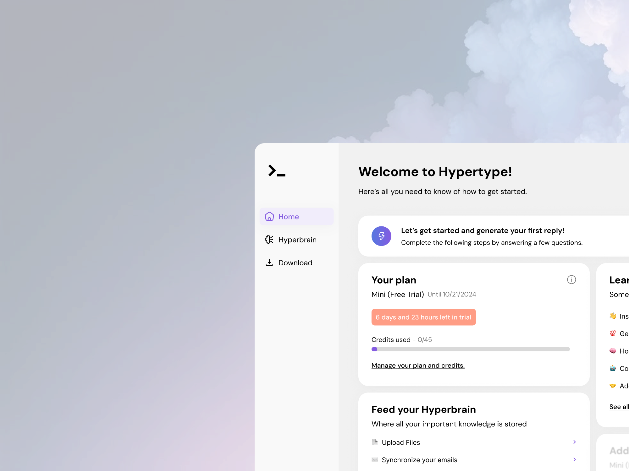
Problem
The initial onboarding and welcome dashboard did not clearly communicate value progression, making it harder to guide free users toward paid plans.
Measurable outcomes
- 1 end-to-end redesigned dashboard welcome concept produced in a single challenge cycle.
- 5 connected product surfaces redesigned to support activation and upgrade cues (Dashboard, Get Started, Feed Brain, Help Center, Subscription).
- No production A/B test data was available; outcomes are framed as delivery and UX-conversion proxy evidence.
1. 30-second summary
This project was a conversion-focused redesign challenge for Hypertype.ai. I chose to redesign the dashboard welcome experience and connected flows where users evaluate value early in the product journey.
The goal was to reduce ambiguity, improve progression clarity, and create clearer upgrade signals without relying on aggressive paywall patterns.
2. Problem + constraints
As a first-time user, the initial dashboard and question flow felt under-explained. Key actions were present, but users were not clearly shown why each step mattered or how they moved toward product value and paid-plan relevance.
- Design challenge context meant no direct access to production analytics or live experiments.
- Needed to prioritize conversion intent while keeping trust and comprehension high.
- Work had to be delivered quickly with realistic scope and coherent interaction logic.
3. My role + ownership boundaries
I owned
- Problem framing and flow prioritization for activation-to-upgrade moments.
- Low-fidelity and high-fidelity UX/UI design across key surfaces.
- Feature hierarchy and lock-state patterns to communicate premium value.
I shared
- Assumptions based on comparable SaaS onboarding patterns and conversion heuristics.
- Tradeoff framing between engagement prompts and cognitive load.
- Hypothesis design for what should be tested first in production.
Out of scope
- Implementation and engineering instrumentation for production analytics.
- Live experimentation setup and billing funnel integration.
- Retention outcomes beyond initial activation and upgrade intent.
4. Key decisions
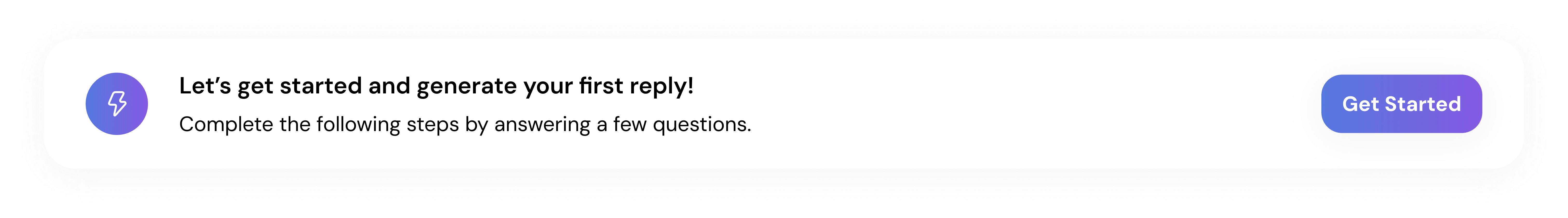
1. Add a clearer transition into first-time questions
- Decision
- I added contextual framing before users entered the question flow, so they understood purpose and expected outcome upfront.
- Why
- The original sequence moved users directly into prompts without enough orientation, increasing confusion risk.
- Result
- The redesigned flow better supports comprehension and progression clarity, which is a conversion proxy for early activation quality.
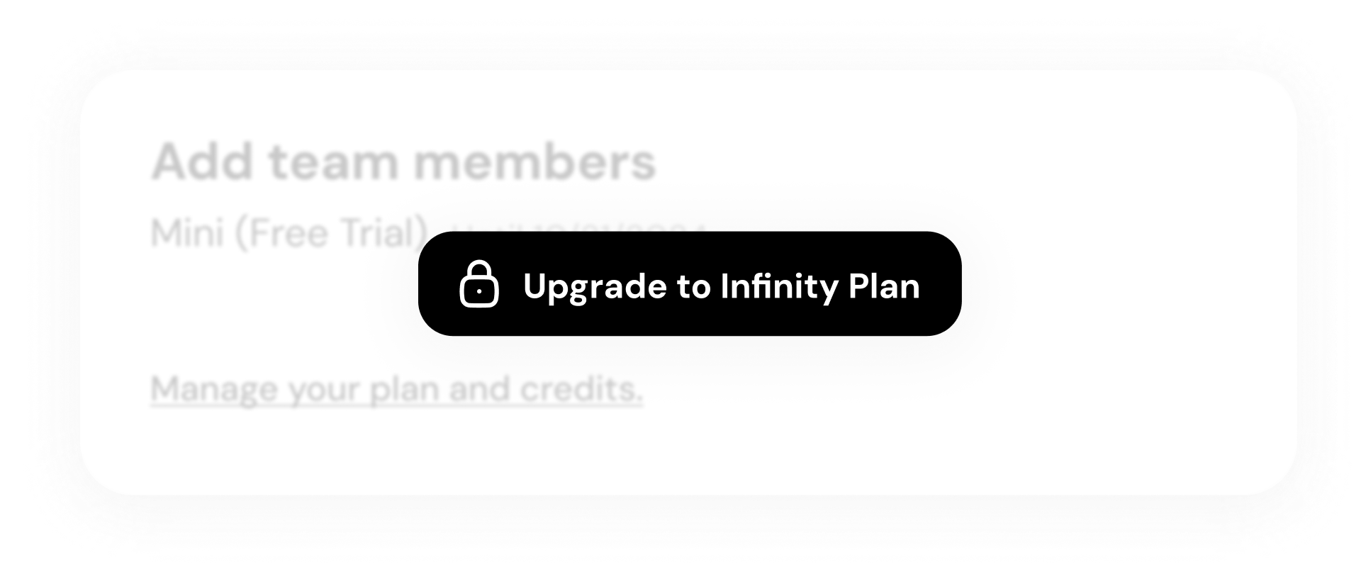
2. Use locked-feature visibility as a value signal
- Decision
- I intentionally exposed premium-locked elements in the dashboard to communicate capability depth without interrupting core free usage.
- Why
- Users need to see premium value in-context before considering an upgrade decision.
- Result
- Upgrade pathways are now embedded in usage context rather than isolated in pricing-only moments (proxy improvement).
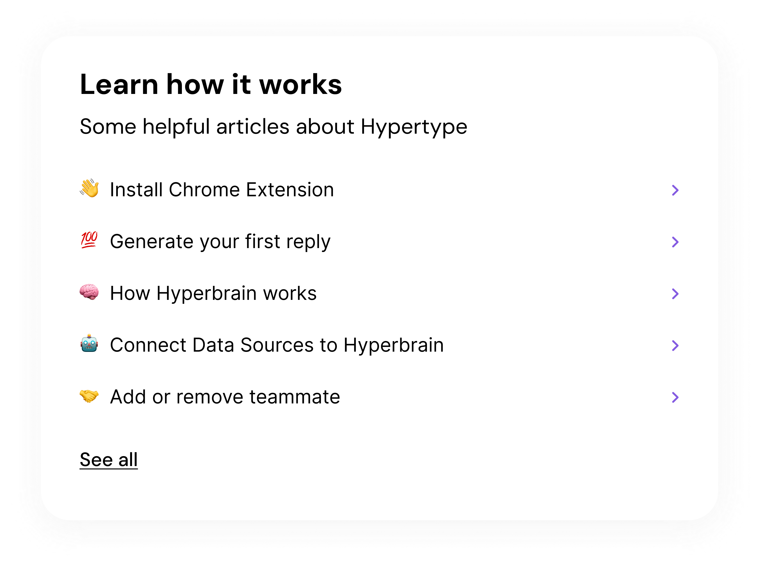
3. Design connected support flows instead of a single-page redesign
- Decision
- I extended the redesign into Get Started, Feed Brain, Help Center, and Subscription surfaces to preserve consistency across the full activation arc.
- Why
- Conversion friction usually appears across transitions, not only on a single screen.
- Result
- The concept now presents a consistent value narrative from onboarding through plan evaluation.
5. Outcomes
Because this was a design challenge rather than a live release, outcomes focus on delivered scope and conversion-readiness proxies.
Measured
5 surfaces
Redesigned in one coherent conversion narrative
Dashboard, Get Started, Feed Brain, Help Center, and Subscription were redesigned in November 2024.
Measured
1 end-to-end concept
Challenge-ready handoff package delivered
Included low-fi exploration, high-fi solution, and supporting flow screens for activation and upgrade intent.
Proxy
Higher intent clarity
Upgrade rationale becomes visible in product context
Design uses in-context premium signaling and clearer progression framing to improve upgrade decision readiness.
Note: No production funnel or experiment data was available in this challenge setting, so conversion impact is intentionally framed as proxy evidence.
6. What I’d improve next
- Run first-session funnel instrumentation to quantify where users drop before seeing premium value.
- Test two lock-state strategies with A/B experiments (contextual tease vs milestone reveal).
- Add lightweight in-product education moments tied to real user tasks rather than static onboarding text.