Case Study
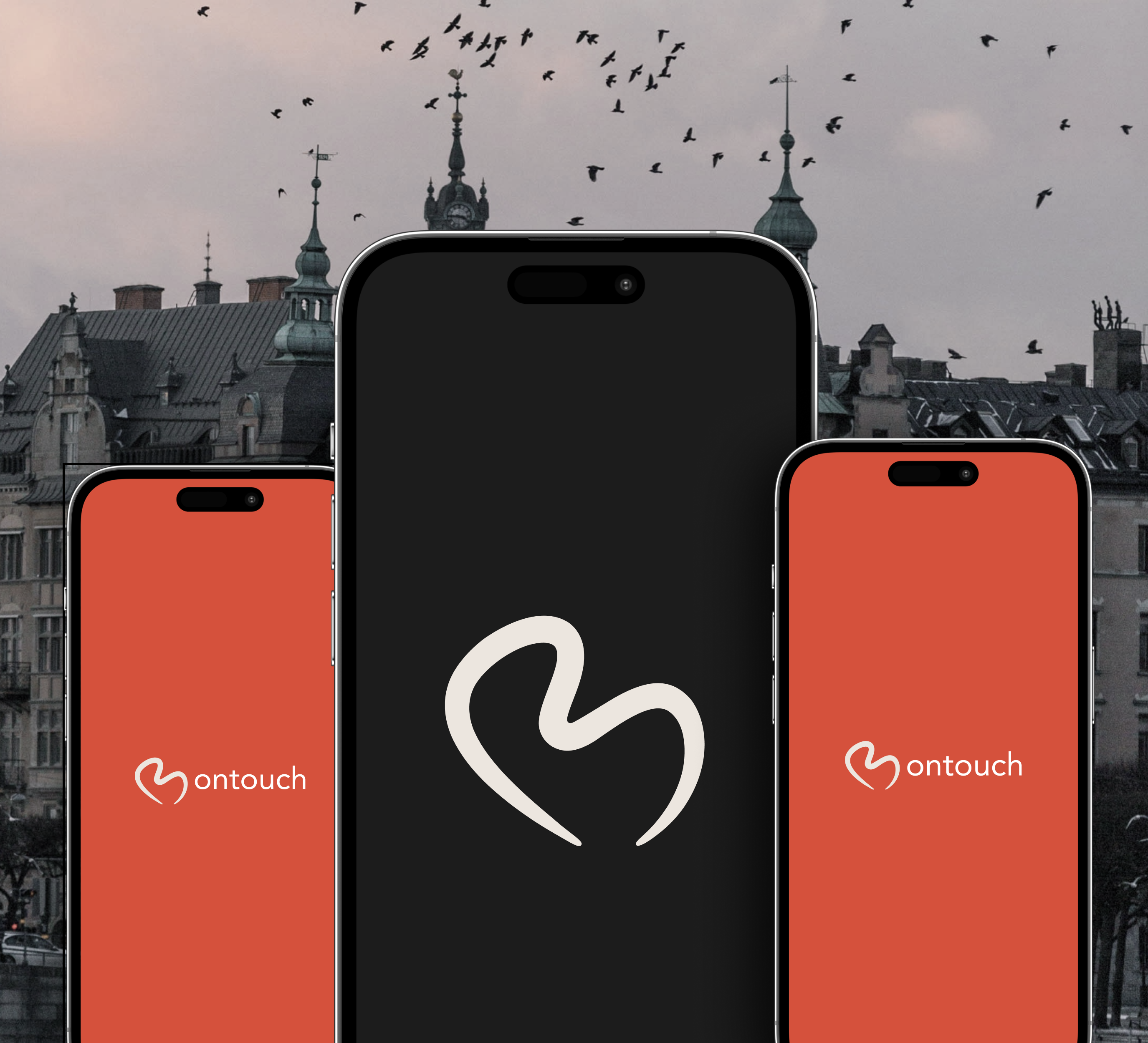
Bontouch (Framna)
A five-month internship focused on improving onboarding clarity, introducing in-app review prompts, and strengthening design-system consistency. My biggest takeaway was learning how to work in a professional team and collaborate on real digital products. I got hands-on experience in both UX and UI, with my main focus on UI design.
Outcome Snapshot
Role
UX/UI Design Intern
Timeline
November 2023 - May 2024 (5 months)
Team
Mentored by a senior UI designer; collaborated with product owner, developers, and client stakeholders
Problem
The app had weak ratings, onboarding readability issues, and inconsistent component usage that made updates slower and less coherent.
Measurable outcomes
- App Store rating moved from 2.4 to 4.7 during the five-month window (with multiple product changes in parallel).
- Onboarding tests showed 5/6 participants recalled key information and 6/6 felt content volume was manageable (moderated, n=6).
- Design-system restructuring introduced reusable component patterns for final proposal screens (delivery proxy).
1. 30-second summary
During my internship, I worked on product improvements that directly affected app quality signals and user comprehension. The work combined interaction design, stakeholder communication, and practical implementation constraints.
I focused on three bets: add an in-app review flow, redesign onboarding for readability and recall, and improve the component system so future screens could stay consistent.
2. Problem + constraints
The team needed user-facing quality improvements that were defensible to both client stakeholders and internal product teams. At the same time, legacy design files lacked consistent component structure, which slowed down iteration and increased visual drift.
- Internship scope required clear ownership boundaries and close mentorship alignment.
- Client-side approvals meant proposals had to be backed by rationale and evidence, not only visual polish.
- Most usability evidence came from small-sample moderated sessions, so claims needed tight framing.
3. My role + ownership boundaries
I owned
- UX/UI design concepts for in-app review prompts and onboarding improvements.
- Prototype quality checks, design system cleanup proposals, and visual consistency updates.
- Presentation artifacts used to communicate recommendations to stakeholders.
I shared
- Interview planning and test synthesis with senior UX and product counterparts.
- Feasibility alignment with developers around implementation details.
- Prioritization tradeoffs for what could ship inside internship timing.
Out of scope
- Final roadmap ownership and release sequencing decisions.
- Engineering implementation and platform-level experimentation frameworks.
- Long-term client budget and portfolio strategy.
4. Key decisions
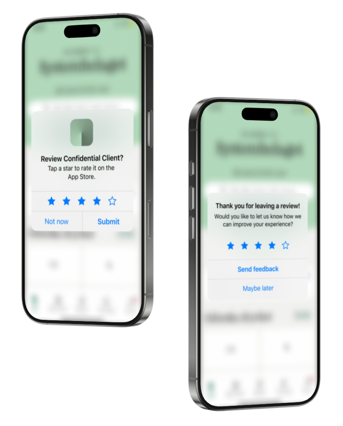
1. Add in-app review prompts at the right moment
- Decision
- I designed a lightweight in-app rating flow to request feedback after positive user moments instead of relying only on store page discovery.
- Why
- The app had low ratings and limited direct feedback loops, which made quality improvements harder to prioritize.
- Result
- From November 2023 to May 2024, rating moved from 2.4 to 4.7. This is a correlated outcome alongside other product updates, not a single-feature claim.
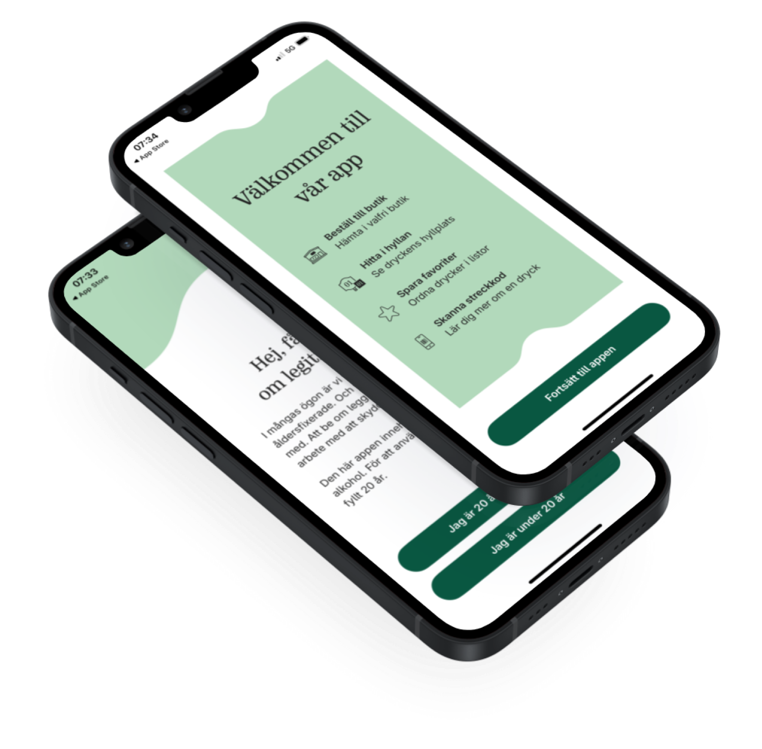
2. Rewrite onboarding for readability and retention
- Decision
- I simplified copy hierarchy, adjusted pacing, and integrated the new pickup-ordering concept without increasing cognitive load.
- Why
- Existing onboarding was hard to scan, and user feedback indicated poor recall after completion.
- Result
- In moderated sessions (n=6), 5/6 users recalled key information and 6/6 said the content amount felt manageable after the redesign.
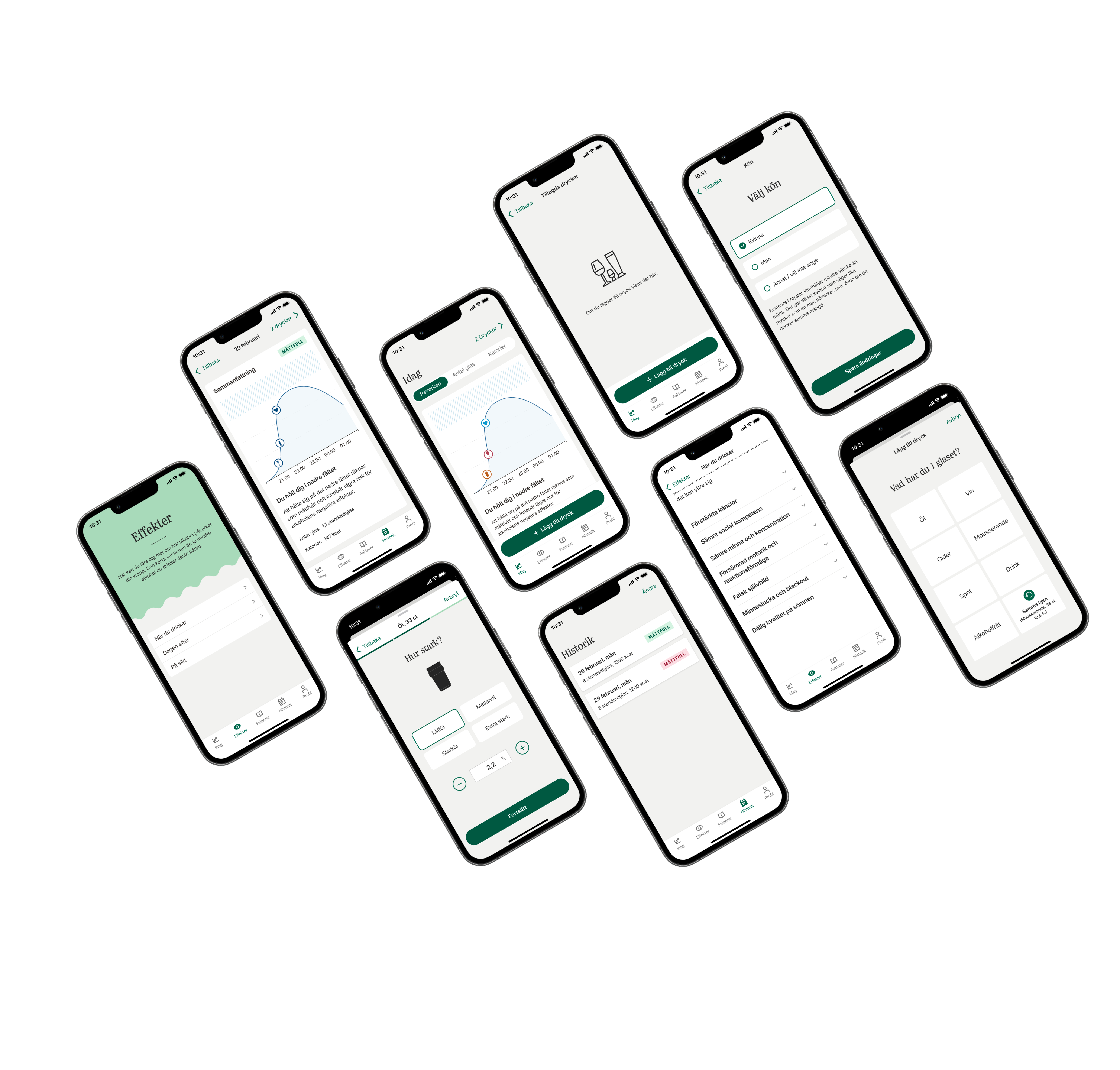
3. Restructure components to reduce visual drift
- Decision
- I introduced clearer component composition patterns (including nested structures and auto-layout usage) in proposal work.
- Why
- Legacy files had inconsistent construction, making updates slow and increasing mismatch risk between screens.
- Result
- Design updates became easier to maintain in final internship deliverables, and stakeholders received a more coherent modernization proposal (delivery proxy).
5. Outcomes
These outcomes combine direct product signals and small-sample validation data from internship projects.
Measured
2.4 -> 4.7
App rating change in five months
Observed between November 2023 and May 2024 after in-app review launch and other product improvements.
Measured
5/6 users
Recalled key onboarding information
Moderated onboarding evaluation with six participants after redesign.
Measured
6/6 users
Reported content felt manageable
Same moderated test sample (n=6) reported information volume was useful and not overwhelming.
Note: Sample sizes were intentionally small during internship testing. Evidence is framed with participant counts and timeframe to avoid over-claiming.
6. What I’d improve next
- Run a larger unmoderated onboarding study (target n>=30) to validate readability findings at scale.
- Instrument prompt-level analytics for in-app review timing and completion rates.
- Set component governance with documented adoption checkpoints to sustain design-system consistency.